Second Quarter 2018
“Trade wars are good and easy to win”
– President Donald J. Trump
Though we have never opened our commentary with a disclaimer, let there be a first time for everything. By the time you read this, many of the proposed tariffs on various countries will most likely have changed terms. Rather than double-decimal precision on the amount of the proposals, it is far better conceptually to try to share the potential meaning and impact of this escalating battle.
President Donald Trump and many of his economic advisors have argued that trade deficits (where the United States imports collectively more goods and services than it exports in return) are the scoreboard for how foreign countries are taking advantage of the U.S. He has described deficits with countries such as China as money “lost” to the trading partners.
“Last year, we lost $500 billion on trade with China,” Trump said in March. “We can’t let that happen.”
Most economists dispute Trump’s interpretation of a trade deficit or that such imbalances have hurt the U.S. economy or job growth, as Trump contends.
Simply speaking, the U.S. runs a trade deficit because it consumes more than it produces while its trading partners, collectively, do the opposite. Over a shorter-time horizon, trade deficits may rise and fall depending on the relative disparity in economic growth rates. An upswing in spending power for the U.S. consumer, for example, may increase imports without the offsetting export growth should foreign economies slow. This would increase the deficit.
Some impacts are more long-lasting. The recent tax cut that took effect on January 1, along with the recent increase in federal spending of $300B that was passed in February, spurred business investment and increased household spending. From this, we can anticipate that U.S. imports should climb and the recent uptick in economic growth running counter to slowing global growth shows this. With demand increasing at a time when the U.S. unemployment rate is hovering around 4%, employers do not have enough workers to meet the requirements and imports safeguard against an overheated economy and potentially rising inflation.
Permanently reducing the U.S. trade deficit would necessitate some combination of the United States saving more (hence spending less which negatively impacts economic growth) or other countries spending more. As these are heavily driven by other structural factors such as demographics, social safety nets and the availability of credit, it would be quite a challenge.
None of this is to argue against the administration’s need to target China and their transgressions against U.S. intellectual property rights and other violations of rules set forth by the World Trade Organization (WTO). Intellectual property refers to inventions, artistic works, brands, names and images used in business. They are protected by law via patents, copyrights and trademarks. There is strong evidence that China has counterfeited major brands, stolen trade secrets and forced companies (in return for the right to do business in the vast Chinese markets) to share technology via requirements for joint ventures with Chinese firms.
China still falls woefully short of fulfilling the requirements of the WTO to protect intellectual property 17 years after joining the organization. It is estimated that about 70% of all software used in China (valued at nearly $8.7B according to the Cato Institute) is stolen with the annual cost to the U.S. of all stolen and pirated property to be as high as $600B. Still, in targeting not just China but our North American neighbors and European allies threatens to harm American workers, businesses and consumers and most certainly pose a threat to both the domestic and global economies.
While tariffs are technically paid by whomever imports the goods in question, importers will try to pass along their costs to consumers. A seemingly innocuous example occurred in early January in one of the earliest tariffs to go into effect, the imposition of 20% tariffs on washing machines. These are major appliances that consumers do not buy very often. As such they would be unlikely to notice the month-to-month price swings as they would on eggs for example.
What followed was an increase over the last three months of about 17% in the price index for laundry equipment as estimated by the Labor Department’s consumer price index, by far the largest three-month price increase in over 12 years. Now apply this same logic to the large tariffs now imposed on lumber, aluminum and steel. Estimates from both the housing and auto industries estimate cost increases of $9,000 on the price of a new home and over $5,000 on the cost of a new car. Unlike washing machines, these are critical industries to our overall economic growth.
The Joint Committee on Taxation has estimated that American taxpayers will save about $75B from tax cuts in 2018 and an additional $189B in 2019. The euphoria of this increase in disposable income may be short-lived for the U.S. consumer, however, as the Administration’s tariffs on imports threaten to negate much of this relief with rising energy costs adding to this concern.
Tariffs already in place include 25% on steel, 30% on solar panels, 10% on aluminum, 20% on lumber and 20% on washing machines. As of early July over 800 Chinese imports now face a tariff of 25% with a threat of an additional 10% on as much as $400B more products if China were to retaliate. It is estimated that the current and pending tariffs could cost the American consumer as much as $125B per year in increased prices.
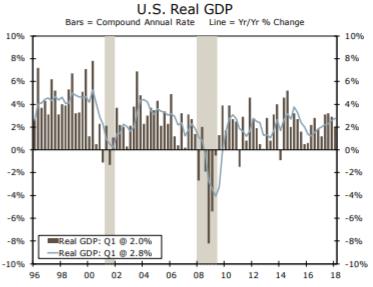
The U.S. economy continues to chug along with 2Q growth anticipated to be the highest quarterly mark since the 5.2% rate of growth achieved in 3Q 2014. 1Q GDP growth was much softer than the previous three quarters, which averaged 3.1%. With a final reading of 2.0% (chart below from Wells Fargo), the first quarter has come in weaker in the last several years suggesting that seasonal factors are partly to blame. The primary culprit in the quarter was a weak level of consumer spending following strong reports at the end of 2017 that we had noted were unsustainable.
June of this year represented the start of the 10th year of the economic expansion, now the second longest outside of the 1990s tech boom. Much has been made of the length of the economic expansion as the historic average length of the growth cycle is closer to 60 months.
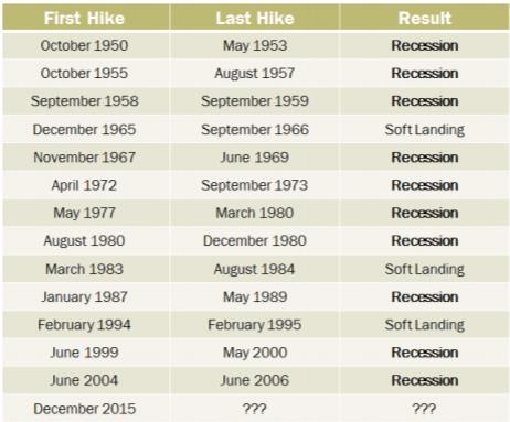
While it is often said that no expansion dies of old age, they inevitably do die, and when the usual suspects are rounded up, it is the Federal Reserve that is usually picked out of the lineup. Recent fiscal stimulus may have extended this economic cycle, but it has not been repealed. Indeed, of the last 13 hiking cycles engineered by the Federal Reserve, fully 10 of them landed the economy in recession (see charts below from Gluskin Sheff).
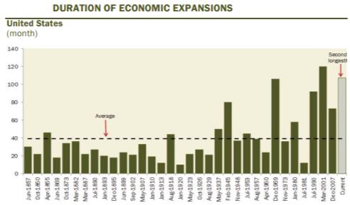
However, many point to the magnitude rather than the duration of the recovery which may tell a different story. While the current expansion has lasted over 9 years, the cumulative growth of GDP has only been 21%. This shallower, low-growth trajectory leads many economists to believe that the cycle has more room to run and this message appeared to gain more fans with the release of the June employment report. With continued strong job creation alongside contained wage pressure, the economy continues to run not too hot and not too cold.
Recently, the administration may also look very proudly at the contributions to growth from the manufacturing and trade sectors. Despite the headline focus on the burgeoning trade war, the United States just released data showing the lowest trade deficit since October of 2016. Exports were very strong and benefitted with the usual lag from the 18-month decline in the trade-weighted dollar. This decline appears to have ended for now in mid-April as the year-over-year price change in the U.S. currency has moved from a decline of almost 10% in January to a modest increase as of early July.
We are often asked following a quarter or two of above trend economic growth as to whether or not we are entering escape velocity whereby the level of growth takes a discernable shift upwards. We again will answer the query in the following manner.
Sustainable trend growth in GDP is a product of labor force growth (specifically aggregate hours worked) plus productivity growth. Productivity has recently shown some signs of waking up from a long-term malaise that has reduced the five-year trend to 0.5% but the most recent 1-year level around 1% remains well below historical averages. Labor force growth is pretty much baked in as demographics lead the Congressional Budget Office (CBO) to project the next five years to continue the recent trend in soft increases in the labor force of around 0.5% annually.
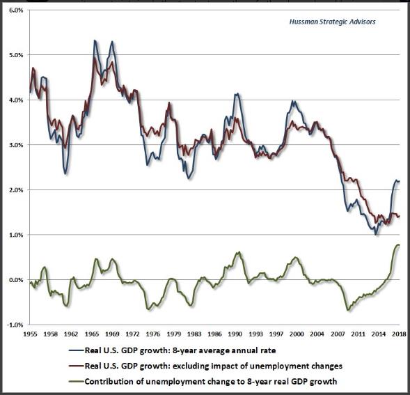
It is often ignored but worth noting that the already low economic growth exhibited in the U.S. during the recovery was largely due to the contribution of workers rejoining the labor force since 2009. According to work done by John Hussman, the increases in employment added about 0.8% (the green line in the following chart) to our average annual economic growth. The blue line in the graph represents the actual eight-year average for growth while the red line excludes the impact of employment growth. With the unemployment level already down to a multi-decade low around 4%, this tailwind is being removed from future GDP increases.
For now, the combination of strong employment gains and the immediate benefits of the tax cuts are leading a solid recovery in consumer spending in the just-completed 2Q period that will erase a slow 1Q pace. While 2Q GDP growth will show a large rebound from the tepid pace of 2% in 1Q towards 3.5%, we are cautious that this may represent the high-water mark for the year. Though the economy will continue to benefit from tax cuts and increased fiscal spending, the risks are heightened from the lagged effects of the cumulative impact on liquidity of the tightening actions of the Federal Reserve and the implications of the growing tariff and trade conflicts with the benefits of the lower dollar increasingly appearing to be in the rear-view mirror. We look for full-year GDP to end up at the high end of our original estimate of 2.5%-2.75% growth.
The headline PCE (personal consumption expenditures) deflator is the preferred inflation gauge of the Federal Reserve that has long targeted a 2% core (ex-food & energy) reading. For the Fed, core inflation will remain the primary focus for the near-term path of policy. After slowing to 1.3% as recently as August, this level was achieved in the reading for May with energy prices adding to the headline gain of 2.3%y/y (see chart below from Wells Fargo) and the core level rising to 2%, the highest level since early 2011. The unwinding of what increasingly looks to have been one-offs—like the plunge in wireless services and abrupt slowdown in housing costs—has helped the core rate of inflation vault back to where it was at the start of 2017.
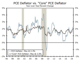
Trends in the PCE deflator support the Fed’s policy goals this year, and neither the rise in CPI or PCE inflation suggest a more aggressive approach by the Fed to be warranted. If inflation continues to firm in line with expectations, we would expect another increase in the funds rate for each of the next two meetings.
However, there is a larger concern now emerging in the form of higher oil prices and the escalating tariff wars. The recent few years may be characterized as having exhibited excess slack in the production supply chain. When this occurs, delivery times are shortened and pricing power from suppliers is weak. The opposite is now occurring as utilization rates are high and rising and delivery times are now more stretched. According to the Institute for Supply Management (ISM), factories as of the May report are now waiting 67 days for materials, which matches the longest period since 1987. Additionally, the ISM reported that 79.5% of the firms surveyed said they were paying higher prices, which is the highest level since 2011. With the average cost of goods that are leaving factories now rising at the fastest rate since 2011, the current approach of the Federal Reserve may be tested.
2018 will likely mark a dramatic shift in global monetary policy that may trump the changes on the fiscal front as the prior ten years of financial tailwinds give way to increasing headwinds.
Janet Yellen’s last meeting as Fed Chairperson in December marked the fifth increase in the federal funds rate (now 1.25%-1.50%) since the end of 2015. That there was little market response indicates a collective view that the new head of the FOMC in the new year will maintain the measured pace of rate increases of the past few years. The consensus view of economists is for an additional two to three rate hikes in the new year.
Central bank officials signaled at their June meeting that they might pick up the pace of interest-rate increases this year and into 2019 to keep a rapidly expanding economy on balance. Fed voting members have upgraded considerably their economic outlook over the past year—first because of a synchronized upturn in global growth beginning last summer, and later after Congress approved stimulus in the form of tax cuts and increased federal spending. The majority of the FOMC now expect at least four rate increases this year and another three next year leaving short rates near 3.5% by 2020.
Policy makers have long focused on the inverse relationship between the unemployment rate and the associated increase normally realized in higher wages and inflation referred to as the Phillips curve. This simple relationship has been broken during this period by dramatic changes in demographics that have reduced the labor force participation rate along with the globalization of the labor market.
Persistently low inflation, and thereby inflation expectations, have lowered the incentive of workers to seek higher wages, while also limiting the need for firms to offset higher wages by passing them on via higher consumer prices. The Fed appears to believe that this cycle is breaking.
The above pace of tightening will now combine with an increase starting in the current 3Q period of greater balance sheet normalization as the Fed increases the pace (now at $40B per month) of allowing maturing Treasuries to be run down over time. For contrast, at its peak, Quantitative Easing (QE) was running at a pace of over $85B of asset purchases per month. A lot of excess liquidity is being drained from the system and is working in conflict with the fiscal stimulus of tax cuts and increased spending.
While sensitive to the short-term concerns of escalating inflation pressures, we are still skeptical of any longer-term concerns in this area due to the continued inflation headwinds of an aging demography, high levels of debt and accelerating impacts from automation. Noting recent increases in the delinquency rates for auto and credit card loans, we see rising evidence of increasing financial strains on mid-to-lower-credit households that may portend slower economic growth in 2019. The Federal Reserve is balancing these conflicting signposts and we do not have confidence in such linear projections of interest rate increases in a dynamic price environment. Should the economy slow into the new year, we expect the Fed to ease off from these estimates.
Economists have debated how tight the pool of available labor is in the U.S. as the implications for wage gains are critical in determining Fed policy. With the aging baby boomer cohort having the anticipated effect of decreasing the overall labor force participation rate (see blue line in chart on following page) even after years of strong employment gains, there remains the very real question as to how much slack is truly available in the labor force. Critical to any analysis in this area is the data on the prime-age (25-54-year-old) labor force participation rate that excludes the impact of demographics found in the overall labor force data.
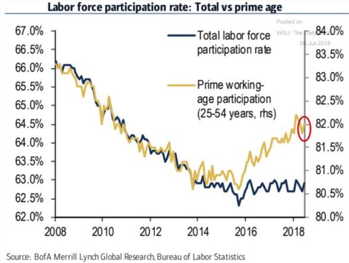
There are many potential causes for a lower prime-age labor force participation rate (increased levels of workers claiming disability, increases in opioid addiction, and higher incarceration rates among them), but these levels have been improving over the last three years (see yellow line in chart above). Though the rate is only about halfway back to its pre-recession peak and this approximate 1% decline may represent as much as a million additional workers, we do not anticipate reaching those prior peaks.
Moreover, the total pool of available labor—workers officially counted as unemployed plus those not in the labor force but want a job—continues to hover at the lowest rate since 2001. The dwindling availability of workers and especially skilled job seekers (the number one problem most commonly cited by small businesses) should lead to a resumption of downward pressure on the unemployment rate and upward pressure on wages, as some businesses try to attract workers via higher pay. With fewer workers on the sidelines and slowing population growth, we continue to expect job growth to moderate from the nearly 200K monthly average over the past year towards 150K.
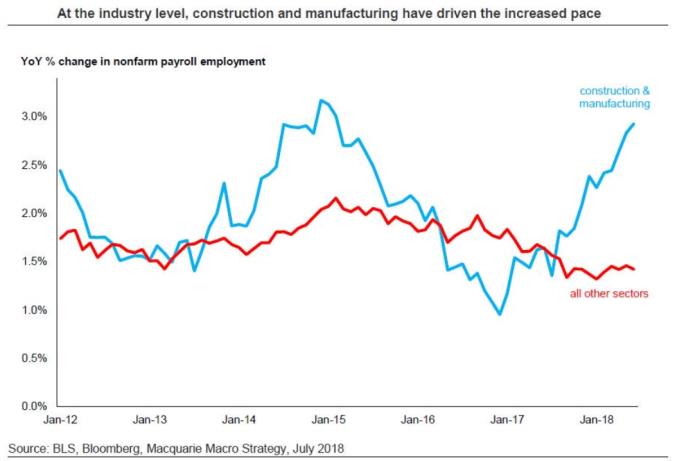
Tariffs may represent another reason to expect some softening in the rate of labor force growth. The manufacturing sector has added over 55K jobs in the last two months and continues to be an area of strength in the labor market. However, there are risks going forward as this key part of the U.S. economy has not yet felt any impact from tariffs. As the chart below from Macquarie depicts, labor force growth outside of the manufacturing and construction areas (the red line below) has been declining over the prior 18 months. Escalating trade tensions between the U.S. and China haven’t yet deterred employers from hiring, but that may change in the latter half of the year.
Many economists continue to look to still tepid wage growth in supporting the above argument of greater slack in labor markets. In the most recent jobs report from the Bureau of Labor & Statistics (BLS), wage growth as defined by average hourly earnings rose only 2.7% y/y. With inflation also rising, real wage gains are flat. Though this may be viewed as keeping the Federal Reserve on the sidelines with little worry about the economy overheating, we continue to point out demographics, and not a larger pool of available labor, as the primary cause of stagnant aggregate wage growth.
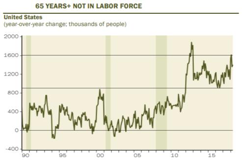
The number of people 65 and over who are now outside of the labor force has grown over 1.4MM in the past year alone. The chart below depicts the increases in this statistic of about 800K annually over the prior seven years. We have noted this demographic change as being materially critical to understanding the wage dynamic as this is putting a ceiling on wage gains. People 65 and older who are working make an average of $911 per week according to data and the chart below compiled from the Household Survey and Gluskin Sheff. This contrasts with $576 per week for those who are between the ages of 20 to 24 and $793 for the 25-34-year-old cohort. Older, higher income workers are retiring and being replaced by younger, lower-wage workers.
Additionally, the continued movement from a goods-producing society to one focused more on services also impacts average wage data. Factory workers on average earn $27 per hour while construction workers are near $30 per hour. This contrasts with the largest service sectors for job gains of retailing and leisure & hospitality that pay $19 and $16 per hour respectively. As the monthly wage data reported with the employment numbers excludes tips and bonuses (which are more prevalent in the service sectors) along with benefits, it is apparent why the Federal Reserve focuses more on the Employment Cost Index which includes those costs in the metric and displays a more healthy (though still moderate) pace of compensation growth. Demographics continue to be a deflationary force in our economy and it will be a challenge to achieve historical levels of wage growth within this dynamic.
Robust consumer spending has been a critical anchor for the nine-year-old economic expansion. But for over two years now, real personal consumer spending has exceeded real disposable personal income. To maintain spending during this period, consumers reduced their savings rate to a 10-year low (from over 6.1% in late 2015 to a recent reading of 2.8%) and continued to increase credit card borrowing. The Tax Cuts and Jobs Act of 2017 got off to a slow start due to withholding issues being addressed in the first quarter, but the current period may represent the peak for disposable income increases and spending data has lifted.
The rebound in consumer spending during the second quarter has been viewed as a confirmation that the U.S. consumer is back and healthy. Recent strong retail spending data along with still solid automobile sales may mask some building concerns.
Rising inflation has eaten away U.S. workers’ recent pay gains. Real average hourly earnings were negative on a year-over-year basis in June rising 2.7% nominally but behind the increase in the Consumer Price Index (CPI) of 2.8%. This disappointing report broke a 14-month stretch of positive inflation-adjusted earnings, which help show how much of their pay increases consumers are getting to keep. This is critical for if nominal gains in wages are exceeded by rising consumer costs, workers are falling further behind.
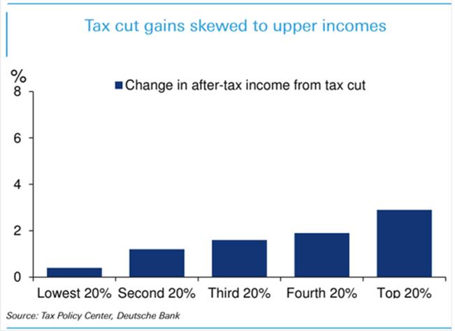
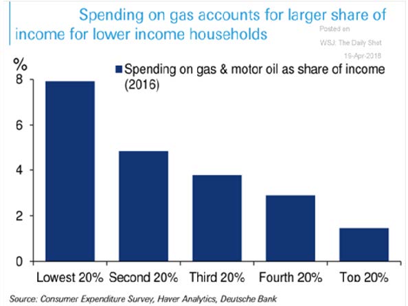
The calculus is even more concerning for the lower quintiles of income distribution especially pertaining to the impact of rising gas prices. According to analysis from Deutsche Bank, the bottom 40% of wage earners are experiencing rising gas prices that more than offset the 1% or less increase in after tax incomes (chart below left). Unfortunately, these lower income cohorts spend more on gas as a share of their income. Therefore, the 20% increase in the cost of filling their gas tanks exceeds the after-tax benefit of the tax cut.
The increase in credit card borrowing during the last two years peaked on a year-over-year basis in November of 2017 at almost 16%. Credit card and other consumer debt (specifically auto loans) remain another area where the impact of rising inflation and increasing interest rates are a rising concern.
The average credit card debt per borrower is estimated at $5,700. The level slowed into early 2018 but has been growing 4.7% per year over the last four years while wages are growing at less than 3% according to data from the Federal Reserve. Credit card reporting company Trans Union suggests that rising rates impact over 92M consumers in the U.S., 9.3M of them severely with cards carrying an average interest rate of 16.8%.
The household Debt Service Ratio compares the total required household debt payments to total disposable personal income so is often viewed as a good measure of the stress of the individual consumer. Though this ratio has risen from a cycle low of 9.9% to the current 10.3%, it remains in a very comfortable zone and well below the peak in 3Q 2007 of 13.22%. However, upon closer inspection there appear to be cracks in the armor of the consumer.
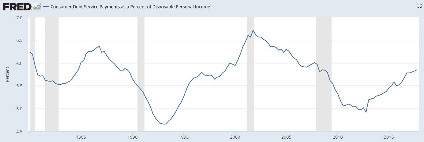
This Debt Service Ratio is comprised of two parts, the mortgage component and the consumer component. With mortgage rates locked in for most existing homeowners, it is the variable component of consumer debt payments that is more quickly impacted by rising interest rates. The impact on housing may be more dramatic over time but affects new homebuyers more in the early stages of a rising rate environment. The chart below focuses on debt payments and indicates this ratio at 5.9% is the highest level since the Great Recession. Indeed, we are now seeing credit card and auto delinquency rates rising to levels last seen in 2012. Though not at alarming levels, the trend is obvious.
Following the bust of the housing market, nearly 4 million single-family homes, many purchased in foreclosure auctions, became rentals (about 3% of the total housing stock). Private equity, hedge funds and large single investors who own dozens or even hundreds of properties are a rising force in U.S. cities, and their purchases have taken a big chunk of homes off the market. There are fewer single-family homes for sale than at any time since 1982. Adjusted for the nation’s population gains in that time, the shortage is even more severe.
As one might expect, this lack of supply has caused home prices to continue to rise over 6% per year during the recovery more than double the level of income growth. Analysts have expected this paucity of inventories to precipitate a housing construction boom. On the contrary, fewer homes are being built per capita than at almost any time in history. We have discussed in prior commentaries many of the reasons for this including fewer vacant lots, land use restrictions, building material costs, and a skilled worker shortage. What’s clear is that new construction in most major cities remains vastly outpaced by demand.
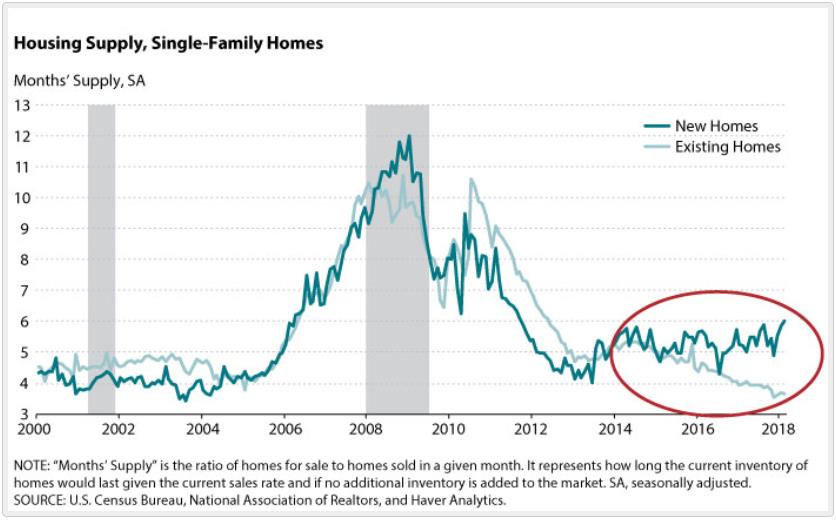
Over the past several months, the pace of U.S. home sales has shown few signs of growth, and as of May 2018, overall home sales were only slightly higher compared with year-ago levels with existing home sales having declined over 3% during this period. Analysts have pointed to this tight housing supply as the key constraint holding back the housing market. However, statistics on housing inventories indicate shortages only for existing homes, while the supply of new homes remains at a relatively healthy level. Existing and new home supplies typically move in sync.
The dearth of inventory is best analyzed by comparing the ratio of homes for sale to homes sold in a given month. Historically, the months’ supplies of new and existing homes have moved in tandem since new and existing homes tend to be close substitutes. However, the chart below shows that in 2015 the relative supplies of new and existing homes began moving in different directions: The supply of new homes remained relatively unchanged while the supply of existing homes fell to a historically low 3.6 months’ worth of inventory before rising this Spring to 4.1. This divergence implies that new and existing homes have possibly become weaker substitutes for one another.
A major reason for this may be found in the changing characteristics of the new home market where builders have focused on higher quality and in turn higher-end markets as the cost constraints noted above have made lower-end homes unprofitable to build. In 2006, the median sales price of new single-family homes was just 10% above the median sales price of existing single-family homes. Since 2010, that gap has averaged over 30%. During this period, the average square footage of new homes has grown by 10% and homes with at least four bedrooms has increased to 46% from 35%. As a result, the traditional first-time homebuyer looking for lower and middle tier housing has increasingly been priced out of the new home market and forced to forage in the existing home market. Recent actions by the administration has exacerbated this situation as 20% tariffs on lumber from Canada has beenthe main culprit behind a near 100% rise in the cost of lumber since January of 2017. The National Association of Home Builders (NAHB) estimates this has increased the cost of a new single-family home by over $9,000.
Another concern on which we have commented is the expectation of “rate lock” potentially impacting the availability of homes for sale. According to Core Logic, a leading provider of property data, this is now becoming a reality as 50% of all existing homeowners had a mortgage rate of 3.75% or less. Evidently all those refinancing commercials were very successful. However, with current mortgage rates now at a seven-year high of 4.6% and rising, many homeowners are being forced to stay put rather than sell their home, struggle to find a new home given the lack of inventory and rising prices and take out a new mortgage with a higher interest rate.
Moreover, we continue to fear that the supply constraints of inventory, rising prices and mortgage rates will remain a high hurdle for many first-time homebuyers despite the strong labor market and growing wages.
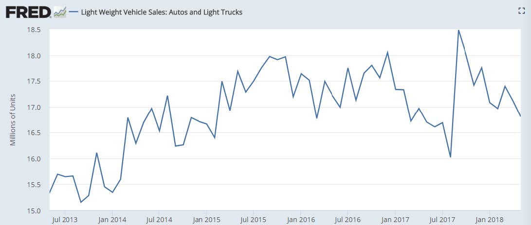
Though auto sales have softened as expected following the late 2017 rebound after the twin hurricanes of Harvey and Irma (see chart below), they have remained at solid levels. According to Experian’s State of the Automotive Finance Market Report, a quarterly review of the most recent trends impacting the auto finance market notes the rise in loan amounts, monthly payments and interest rates for new vehicles. In fact, average new vehicle loan amounts and monthly payments continue to set record highs.
Experian also notes that the average new vehicle loan hit $31,455 in 1Q 2018, an increase of $921 from the previous year and up almost $5,000 from 1Q 2013. The monthly payment for a new vehicle climbed to $523, a $15 increase over the same period with the average interest rate for a new vehicle rising to 5.17% during the quarter.
The explanation for such a modest increase in the payment despite rising loan values and interest rates is that loan terms for new vehicles have also increased during the quarter (slightly above 69 months). While 72-month loans remain the most common loan term, loan terms between 73 and 84 months are now more than 34% of the market compared with less than 7% in late 2009. Even more new loans have now spilled into the 85-96-month bucket.
The extension of the duration of payments may seem innocuous, but it has and will continue to perpetuate an upward bias to monthly payments. According to Edmunds, almost one-third of cars traded in last year were worth less than the loans outstanding with the average car being traded in underwater by $5,130. The dealer sells the used car, and whatever balance remains on the old loan is folded into the new loan. The borrower then extends the length of the loan to help keep monthly payments manageable. More and more borrowers are getting deeper into car debt with every car purchased. Rising rates will only exacerbate this concern.
The population segments most impacted are subprime and deep subprime consumers. The percentage of new vehicle loans to subprime and deep subprime consumers has decreased by 8.4% and 14.1%, respectively. The percentage of new vehicle loans to prime and super-prime consumers has reached 73.4%, the highest 1Q level since 2012 – a sign that some lenders have become more risk-averse. While this should contain delinquencies, it will also further inhibit the growth of vehicle sales.
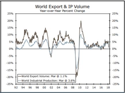
Talk of a synchronized worldwide expansion heralding a longer period of sustainable growth quieted somewhat in the final quarter of 2017. Still the global economy broke from the gates in the new year with a solid degree of forward momentum. This has continued to fade, however, in the first half of the year. Amid concerns of rising protectionism and trade wars, world export volumes have slowed sharply with the year-over-year rate of export growth dropping from a booming pace of over 5% throughout late 2016 and all of 2017 to just 1.1% as of the most recent data from late March (see chart below from Wells Fargo-WF).
The slowdown in growth experienced by many developed economies in 1Q followed an impressive 3.8% global growth rate for 2017. This slower growth appears for now to be more a sign of the late stages of a global expansion rather than a major downturn. However, attention must be paid to the potential impacts of escalating trade wars at a time when the central banks of the developed economies are turning off the spigots of liquidity that helped fuel the current expansion.
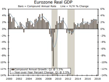
The Eurozone (EZ) economy expanded at 2.5% for the full year of 2017, the fastest pace since 2007. Indeed, the 4Q print accelerated to a year-over-year pace of 2.8%, the highwater mark of the expansion. That pace is likely behind us. Final readings on the 1Q growth rates have slowed to a 1.5% annual rate (chart below left from WF) with industrial production posting negative rates of growth through the early part of the year.
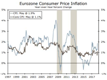
Throughout much of the expansion, the EZ was unable to achieve the mandated target of the European Central Bank (ECB) of a 2% inflation rate. The primary cause may have been the weak dollar which created a major headwind from the beginning of 2017 as the Euro rose more than 20% versus the dollar during this period. The strength in the Euro effectively depressed all import inflation and slowed export growth (critical to the EZ as it represents over 40% of GDP) as prices on exports rose. Since April, however, the Euro has retreated by almost6% versus the U.S. currency. This has finally precipitated the hoped-for elevation in the CPI from 1.3% to the most recent reading of 1.9% (chart on preceding page). While the core rate of inflation (ex-food & energy) remains below target at 1.1%, it too has started to rise.
Though slowing from the unsustainable pace of growth in 2017, we still expect the Eurozone to grow close to 2% this year, a level that given demographics may still be above its long-term trend. The largest threat to the EZ may not be found in growth, inflation or even political or protectionist concerns. Rather, it may be found in how the region responds to the end of the Quantitative Easing (QE) and Negative Interest Rate Policy (NIRP) that has underpinned growth in the region since 2014.
On June 14th, the ECB laid out plans on how they will wind down the nearly €2.5T bond-buying program. In a statement, the ECB said it would reduce its bond purchases from a €30B monthly pace through September to €15B monthly in October through December. At that point, purchases will end though interest rates will be held in negative territory until the summer of 2019. This decision to start phasing out the easy money policies comes at a difficult time with the economy solid but slowing alongside burgeoning trade wars and political turbulence in Italy.
Among the major advanced economies in Europe, only Greece suffered a deeper and more protracted economic downturn during the financial crisis. These two countries were both carrying debt burdens of over 100% of GDP placing both firmly at risk for any major economic shocks. Little has changed for Italy since as an economic malaise and banking vulnerabilities have moved debt burdens even higher despite the efforts of the ECB to keep interest rates exceptionally low. Political upheaval and social unrest is no surprise for a country that recently voted for its 62nd administration since the end of World War II.
The per capita GDP in Italy in 2018 remains 8% below the level achieved in 2007 before the financial crisis triggered the Great Recession. Currently, the International Monetary Fund (IMF) still projects that by 2023 Italy will still not have clawed their way back from the cumulative output losses of the last decade.
While a bailout by the ECB may still be the direction chosen, this would only serve to kick the can down the road and temporarily calm markets. A restructuring (default?) of Italy’s debt may be needed but this is a challenge that is distinct from that of Greece where governments and other international organizations held the majority of the debt. In Italy most of the outstanding liabilities are held by domestic residents, a scenario where a restructuring might send the economy spiraling further if capital were to leave the country. While we expect the ECB and Italian lawmakers to aim for a resolution, the challenges may be too much.
The burgeoning trade fight with the U.S. comes at a difficult time for China with President Xi Jinping facing many economic headwinds. The Trump administration feels Beijing to be vulnerable on trade despite the country’s reduction in its reliance on exports which now account for less than one-third of GDP compared with more than double that figure as recently as 2006. By contrast, trade accounts for about 10% of the gross domestic product in the U.S.
However, China exported an estimated $505.5B to the U.S in 2017 compared with only $129.9B from the U.S. to China. These exports are still a major reason why China’s growth has been able to achieve and even exceed the government’s targets during a period where efforts to slow debt growth has resulted in multiyear lows in factory and fixed asset investments. Additionally, China appears much more reliant on what it is that they do import from the U.S. such as machinery and technology. Deutsche Bank AG estimates that an escalation of the conflict to include $200 billion of Chinese exports would shave between 0.2% and 0.3% from China’s annual GDP growth.
Chinese officials have been bracing for a trade war for months, promising to match the Trump administration measure for measure. Given the disparity in trade, they will run out of measures long before the U.S. The efforts to contain debt growth by slowing investment at the same time as an escalating trade war is causing some in theChina government to call for a reopening of the credit spigot before the trade conflict further dents growth. How China adjusts its economic policy will depend on how much worse the trade fight with the U.S. becomes.
With this backdrop, it is no surprise that the Chinese equity markets have entered a bear market having declined over 20%. While this is more of a closed market and has little impact on the rest of the globe, the Chinese currency is more problematic. A recent tumble in the yuan (see chart below) has somewhat blindsided forecasters and is causing some to worry about potential contagion. This may be a policy tool as depreciating the yuan is one of the two most likely options for China to consider in response to any further tariff impositions on the part of the U.S.
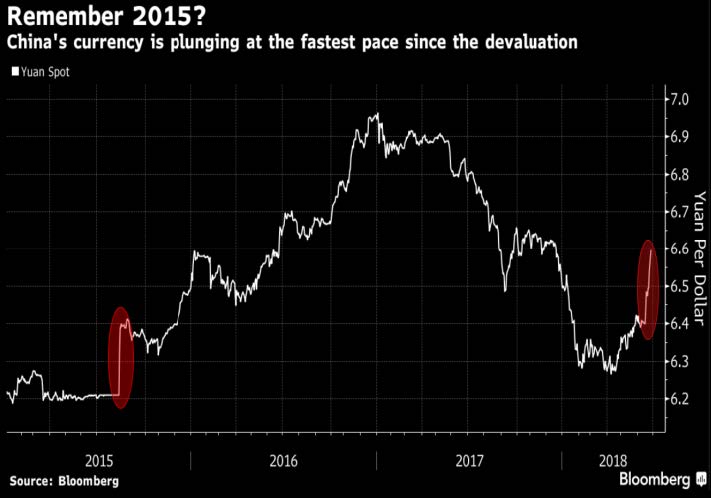
A weaker yuan could make China’s huge export industry more competitive globally, as its makes Chinese products cheaper for buyers who pay in dollars. It appears the main reason for the decline, however, is more likely the strong U.S. dollar as the Chinese currency is still relatively strong compared with other major trading partners such as the euro. This remains front and center in what should be watched as a yuan descent in late 2015 into early 2016 triggered a correction in global markets.
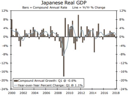
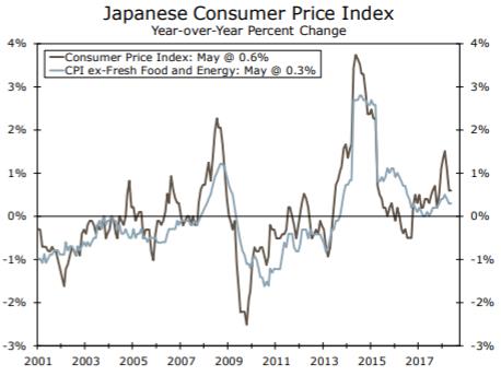
Japan is the world’s third-largest single economy and following more than two years of uninterrupted quarterly growth (the longest such streak since 1989), it contracted at an annualized rate of -0.6% in the first quarter of 2018 (chart top left on following page). Following four quarters where the expansion averaged a full 2%, we do not mark this as a major turning point or the start of recession. However, some of the factors that weighed on growth in the first quarter are emblematic of the challenges facing the Bank of Japan (BoJ) in its efforts to spur the economy enough to sustain its target of 2.0% inflation (chart top right on following page from WF). The animal spirits needed to foment a self-sustaining recovery are clearly missing despite some improving economic data.
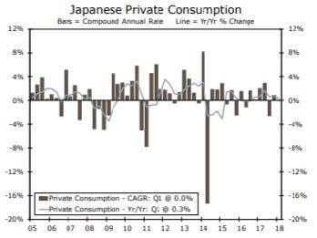
Japan’s labor market tightened even further in May with the unemployment rate moving to a microscopic 2.2% from 2.5%, a 26-year low. With job openings to applicants at the lowest level since 1974, it is hard to imagine wage pressures not beginning to build and inflation following suit. However, after years of a stagnant and contracting economy, Japanese workers remain skeptical and this is manifested in both low consumer confidence figures and tepid spending. Consumer confidence in Japan has been basically flat over the past year or so, and data on retail sales and consumer spending have been inconclusive in 2018, up one month and down the next in (see chart below from WF). Still, as is the case in the United States, a very tight job market should eventually be supportive of higher wage growth which, in turn, should engender future household spending growth.
Following a strong start to 2018, emerging markets stocks have suffered due to political risks and trade clashes between the U.S. and China alongside a rising U.S. dollar and Treasury yields. Following a 10% rise into late January, emerging market stocks as measured by the MSCI-EM index have since declined over 17% into early July, a period that coincides with a near 7% rise in the U.S. dollar.
Globalization has been the key process that has lifted emerging markets over the last quarter century. Trade clashes between the U.S. and China along with the U.S moving towards a more protectionist policy has placed major tension on this thesis. With many analysts fearing potential panic and contagion in this region caused by debt levels that have grown substantially since the financial crisis, fears of the impact of a strong dollar are pronounced. Indeed, in June alone, Emerging Market central banks spent $57B in currency interventions (the most in two years) to arrest the decline in their currencies which are, in aggregate, still down 3% for the year.
Much of emerging market debt is denominated in the dollar. A rise in the dollar means it costs more in local currency to pay back these debts. When the dollar appreciates, foreign central banks (particularly emerging economy central banks) tend to lean against local currency weakness by tightening policy. When the dollar declines, the opposite is usually the case. Hence, the close inverse correlation between the dollar, commodity prices and emerging market risk assets. After financial crises in Latin America in the 1980s and Asia in the 1990s, emerging market governments drastically reduced their foreign currency borrowing denominating an increasing amount of their debt in local currencies to ameliorate this concern.
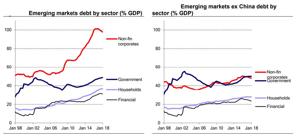
While total emerging market debt has certainly increased over the last decade, a further analysis shows this to be more of a China issue. At 94% of GDP the non-financial corporate sector accounts for close to half of total emerging market debt in contrast to developed economies where debt is more evenly spread across the government, household, non-financial corporate and financial sectors.
However, this distortion may be almost entirely attributed to the rise in China’s nonfinancial sector leverage over the past decade (principally State-Owned Enterprises or SOE). As a percent of GDP, nonfinancial sector debt has risen to 161% from 97% in 4Q2007, and China’s share in overall emerging market GDP has risen to 42% from 23% in 4Q2007. China makes up almost half of the story.
Excluding China, emerging markets have recorded a much more measured increase in leverage across all four sectors to a more evenly distributed debt profile, albeit with typically lower leveraged household and financial sectors. Outside of China, debt to GDP ratios for the government, household, non-financial corporate and financial sectors stand at 50%, 28%, 48% and 23%, respectively, up from 4Q2007 levels of 40%, 23%, 39% and 21%. The increases outside of China have been very controlled as the charts below from Credit Suisse depict.
In the bigger picture, it is helpful to see how far emerging economies have come. To quote Research Affiliates, “EM countries have become much wealthier. Since 2000, China’s real GDP per capita in purchasing power parity (PPP) terms has grown by 60%, India’s by 41%, Korea’s by 24%, and Taiwan’s by 22%. In contrast, Italy’s real GDP per capita contracted by 1%, and those of Germany, Japan, Great Britain, and the United States expanded by about 7%–8%. EM countries have steadily shored up their finances. Foreign exchange (FX) reserves have grown as EM countries have become wealthier. Currently, the average reserve level approaches 25% of GDP, having more than tripled since 1960.”
In 2018, investors find themselves in a new environment compared to last year that was characterized by perhaps the most benign environment in recent investing memory. Volatility has returned with a vengeance due to a more aggressive Federal Reserve and mounting geopolitical and trade tensions. Outsized earnings growth amplified by the corporate tax cuts and enhanced buybacks has engendered a reduction in valuations as earnings have risen far in excess of stock prices.
Though we remain concerned about the potential impacts of a continued escalation in trade wars, we must remember that the reaction and concern of the financial markets to political and geopolitical developments have long been overexaggerated. Markets currently remain near peak levels as the economy has continued to accelerate and corporate earnings growth has rarely been stronger. With massive deregulation and large corporate tax cuts continuing to benefit corporate America, the recent trajectory may have a much longer path.
Despite the early 10% decline in the major averages in late January and increasing volatility, the major domestic indices enjoyed a modest first half of 2018 with the S&P 500 returning 2.6% and the Dow Jones Industrial Average returning 1.3%. Returns in the large cap space of the U.S. market have been increasingly characterized by the leadership of a few names concentrated in the technology and consumer sectors. In fact, almost 90% of the entire return for the S&P 500 so far this year can be attributed to Amazon, Microsoft, Apple, Netflix and Facebook, a trend that was almost as pronounced in 2017. We would prefer that the advances be more broad for a more healthy market environment.
The area of the greatest returns was found in the small cap Russell 2000 index which is home to smaller domestic companies less exposed to foreign revenues and the largest beneficiaries of the corporate tax cut. This sector enjoyed a healthy 7.7% gain. Slowing international growth and heightened trade concerns along with a rising U.S. dollar wore heavily on foreign markets with the developed country index MSCI EAFE losing -2.7% and the MSCI Emerging Market index declining -6.7%
With tax reform providing a huge jolt, 1Q earnings for companies in the S&P 500 grew by over 24.8% according to data provided by FactSet and are estimated to again exceed 20% in 2Q. Comparisons will begin to get more difficult over the next few quarters, and we should expect a slowing in the growth rate. Aside from the high hurdles of the last few earnings periods, trade/tariff impacts, rising labor and input costs along with the stronger dollar and rising interest rates may all present headwinds to earnings growth. However, corporate America has continued to face challenges on the cost side of the equation yet profit margins continue to mine new and higher levels.
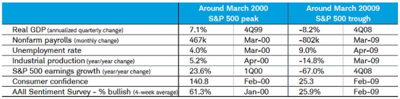
While noting that both the economy and the corporate earnings picture have accelerated in 2018, we should be careful to extrapolate that as a foundational logic for a higher stock market. What is good for “Main Street” is actually rarely good for “Wall Street” as the stock market tends to discount the future. If the present is strong, it is often the case that the future may be less strong, and the market will often anticipate these inflection points. As the chart below from Charles Schwab indicates, the vulnerability of the equity market in March of 2000 corresponded with powerful economic data while the horrific economic scenario around March of 2009 portended a major market move.
With a Federal Reserve intent on normalizing interest rates combined with escalating geopolitical tensions present challenges for investors. At Coho Partners our focus continues to be on downside protection. We seek to provide this from the construction of a differentiated portfolio populated with high quality companies with resilient earnings streams, growing dividends, strong balance sheets and reasonable levels of expectations and valuations.
Sincerely,
Rick S. Wayne, CFA
Eric M. Hildenbrand, CFA
The views, opinions, and content presented are for informational purposes only. They are not intended to reflect a current or past recommendation; investment, legal, tax, or accounting advice of any kind; or a solicitation of an offer to buy or sell any securities or investment services. Nothing presented should be considered to be an offer to provide any Coho product or service in any jurisdiction that would be unlawful under the securities laws of that jurisdiction. Past performance is no guarantee of future results. There can be no assurance that the portfolio will be successful in limiting volatility.
